Lecture Week 4 & 5:Harmony, Unity, Symbol, Word & image.
Kam Zi Ying (0348207)
Bachelor of Mass Communication (Hons) Advertising & Brand Management
Taylor's University
Design Principles
Exercises
Lecture Week 4 & 5: Harmony, Unity, Symbol, Word & image.
Harmony is mean the sense of elements share a common trait that fits in the same theme, aesthetic style or mood in design. The main difference between unity and harmony is that unity has a more obvious focus in a design.
Unity refers to the repetition of elements such as shapes, colours or materials composed in a balance to create a theme throughout the design.
Graphic symbols: design of a sign, shape or object to emphasise the information or represents a story.
Pictorial symbols: image related & simplified pictures
Abstract symbols: fewer details in representing objects
Arbitrary symbols:
-based on geometrical shapes and colours
-invented with meaning constructed
Typography of words and imagery is important to deepen the meaning of design & show the visual hierarchy & balance in a design artwork. It is also relatable to a concept of a brand.
____
Visual Research
Shifted colour harmony
Source: http://www.robinurton.com/blog/creating-harmony-in-color/
Colour harmony
source: https://photos.com/featured/colors-of-humanity-series-marthadavies.html
Unity
Source: https://www.pinterest.com/pin/259660734753975956/
Symbol
Source: https://www.pinterest.com/pin/834151162232900515/
Source: https://www.pinterest.com/pin/222857881549859686/
Word & image
Source: https://www.pinterest.com/pin/89931323800190047/
____
Artwork idea exploration
Harmony
From the visual research of the first figure, the elements of leaves and flowers are matching well with the background using complimentary colour scheme and brings the feeling of peaceful with the shifted colour on background. It reminised me of the stained glass in the church. Hence, I got my idea from the square boxes of stained glass to develop my design artwork.
Stained glass window in church
Source:
https://www.dreamstime.com/brightly-colored-stained-glass-windows-dark-church-modern-stained-glass-old-spanish-church-image103963324
Word & image
To show a deeper information of the image, text is an important element in layout to highlight the overall artwork. I got my inspiration from the clock symbol. To emphasise the main topic of time, I use hourglass in my artwork instead of clock.
____
Final Design
Colour Harmony
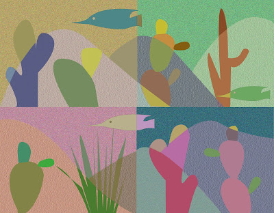
The main inspiration of this artwork is from the stained glass of the window in the church, to make the overall visual looks simple with complimentary scheme theme. The topic of desert in a dimmer tone of colour is shown in the visual to show the harmony between elements and theme, contrasting a peaceful and the quiet ambience of the desert.
Word & Image
The flowing sand of the hourglass in the visual is emphasising the running of time. With the word 'EMPTY' presenting in white colour and lower opacity to highlight the importance of time are going to be empty soon. Meanwhile, the layout of the words around the hourglass are guiding the viewer's eye to look on the overflow of the design.
____
Reflection
At the beginning, I was confused on the differences between harmony and unity. After having research on both topic and analysing the lectures video again, I then understand that Unity is about having a focus point in the overall design. While Harmony is related to a similar theme, colours and feelings. In sum, I was glad that it helps me on developing my idea in a more creative way that i haven't been did before.


Comments
Post a Comment