Kam Zi Ying (0348207)
Bachelor of Mass Communication (Hons) Advertising & Brand Management
Taylor's University
Design Principles
Exercises
Lecture Week 1 : Elements of Design, Principles of Design, Contrast and Gestalt Theory
This week Ms. Jinchi taught the 7 principles of Gestalt Theory and the contrast in design. Gestalt Theory shows how people perceive the world around them to see structure, logic & patterns in a simple way to understand a thing. While contrast occurs when two or more visual elements in a composition are different to generate impact, highlight the importance, create exciting graphics and create visual interest & dynamics.
Visual Research
Principle of similarity
image source: https://creativebeacon.com/design-principles-part-one/

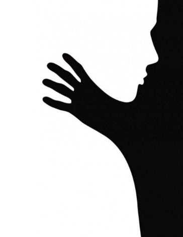
Principle of Figure / Ground
image source (Fig 1): https://www.canva.com/learn/gestalt-theory/
image source (Fig 2): https://pin.it/6MOKWB2
Principle of Continuation
image source: https://pin.it/7fAwRBO
Principles of Closure
image source: https://uxdesign.cc/every-designer-should-know-visual-perception-and-gestalt-principles-5297a5e20312
Principle of Proximity
image source: https://www.canva.com/learn/gestalt-theory/
Law of Symmetry & Order
image source: https://pin.it/xq5jrAD
image source: https://pin.it/34UIGAf
Contrast
image source: https://pin.it/5aLPm6n
Artwork idea exploration
Gestalt Principles
From the above visual research, it was found that most of the gestalt principle artwork is created with the basic elements of shapes, lines and patterns. By using the construction of those elements creates an appealing design that is easy to understand.
Contrast
The visual design of contrast shows the differences in the elements between two or more in composition. When the element appears differently from others, it emphasised the focal point in the overall image. While the most commonly seen contrast is in the image colours, which simply shows the degree of difference between two colours, the lightest and the darkest in an image or the opposite of colours.
Final Design
Law of symmetry & order
The idea of the artwork was mainly inspired by the basic elements of the shape of the square, and the circle of the Olympic logo. Disengaging the overlapping circle of the Olympic logo and rearranging it in order. Parallel square interweaving among the circles to create the sequence of symmetry in the overall shape.
Contrast
The oval shape of ballons represents childhood memories. The background is in a dark tone and a girl holding a bunch of balloons indicates the emotions of preserving the good memories of childhood no matter how bad the surrounding is. Among all the good memories of childhood life, one of the balloons is contrasted in a brighter tone representing the most memorised moments in the memories.
Reflection
Listening to the lecture session, it helps me to explore how design exists in our daily life. I am able to create my artwork by applying the theory in design. Besides, also have a deeper understanding of the basic elements of design.


Comments
Post a Comment